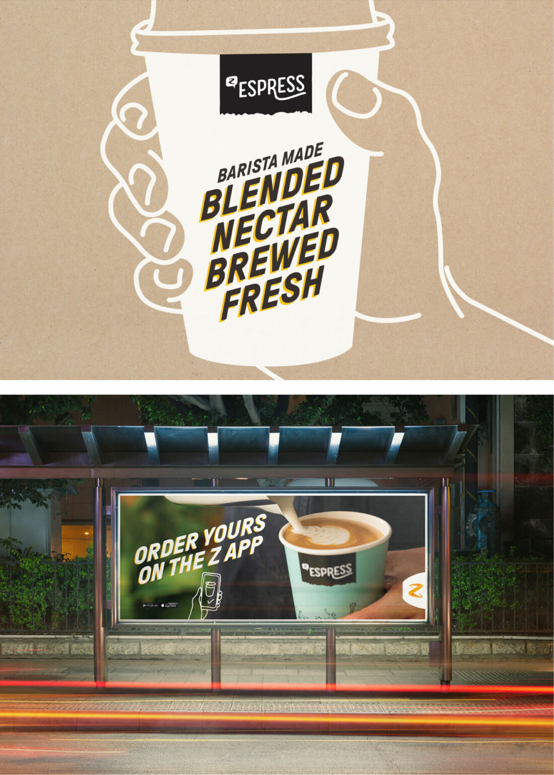
Z Espress
Injecting personality into packaging.
Our challenge was to help their Z Espress range look as good as it tastes with a modernised brand and fresh packaging to match.
A distinctive offer.
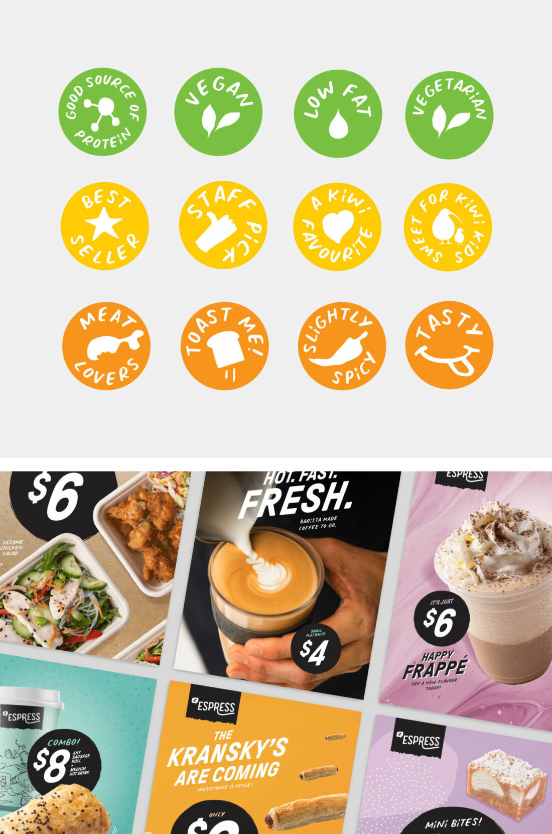
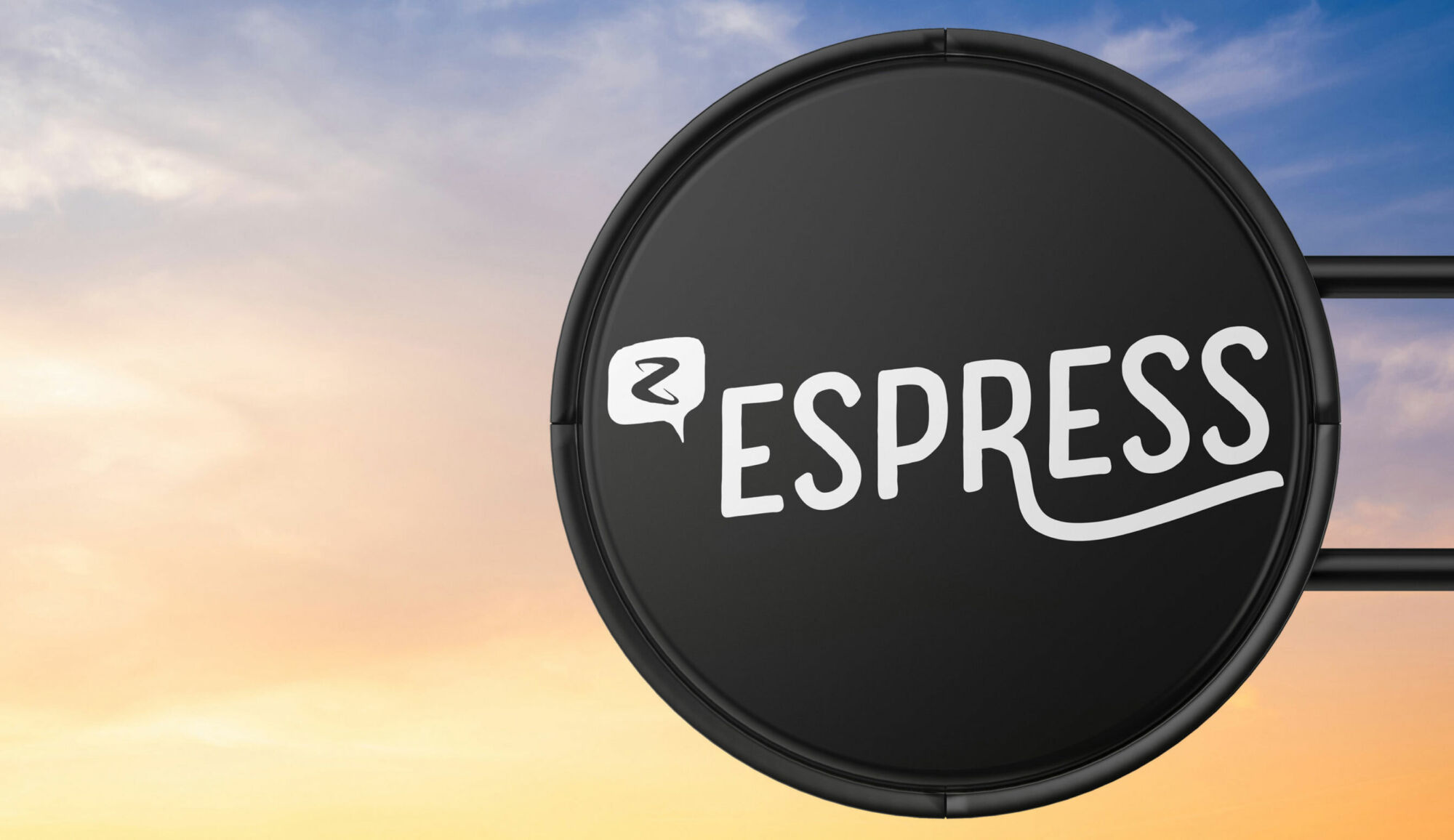
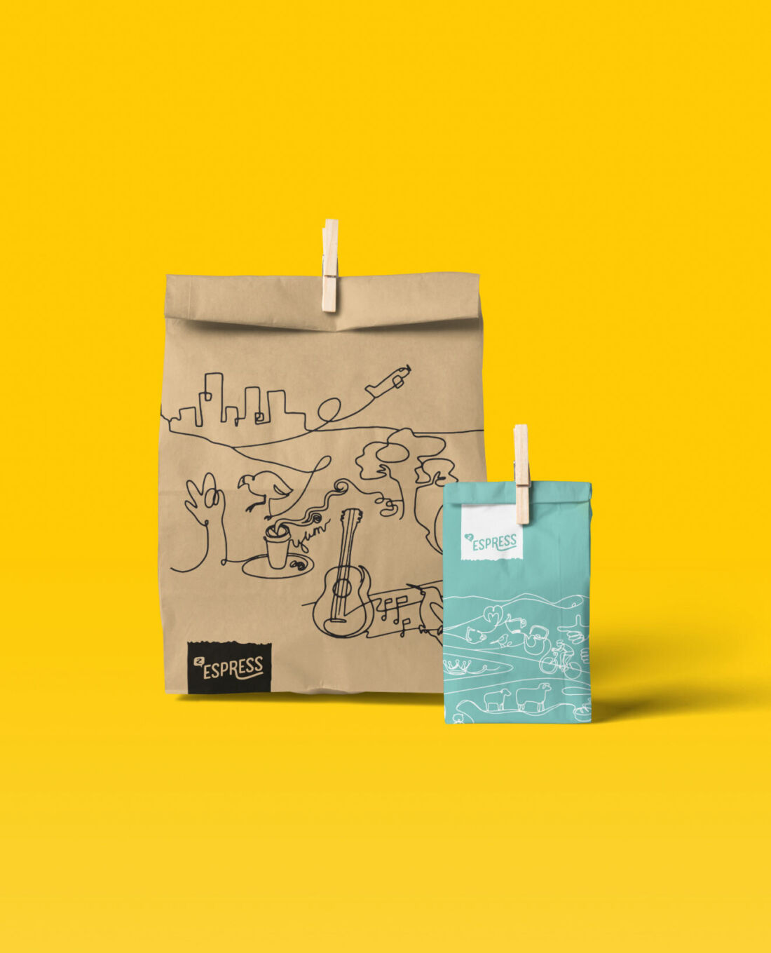
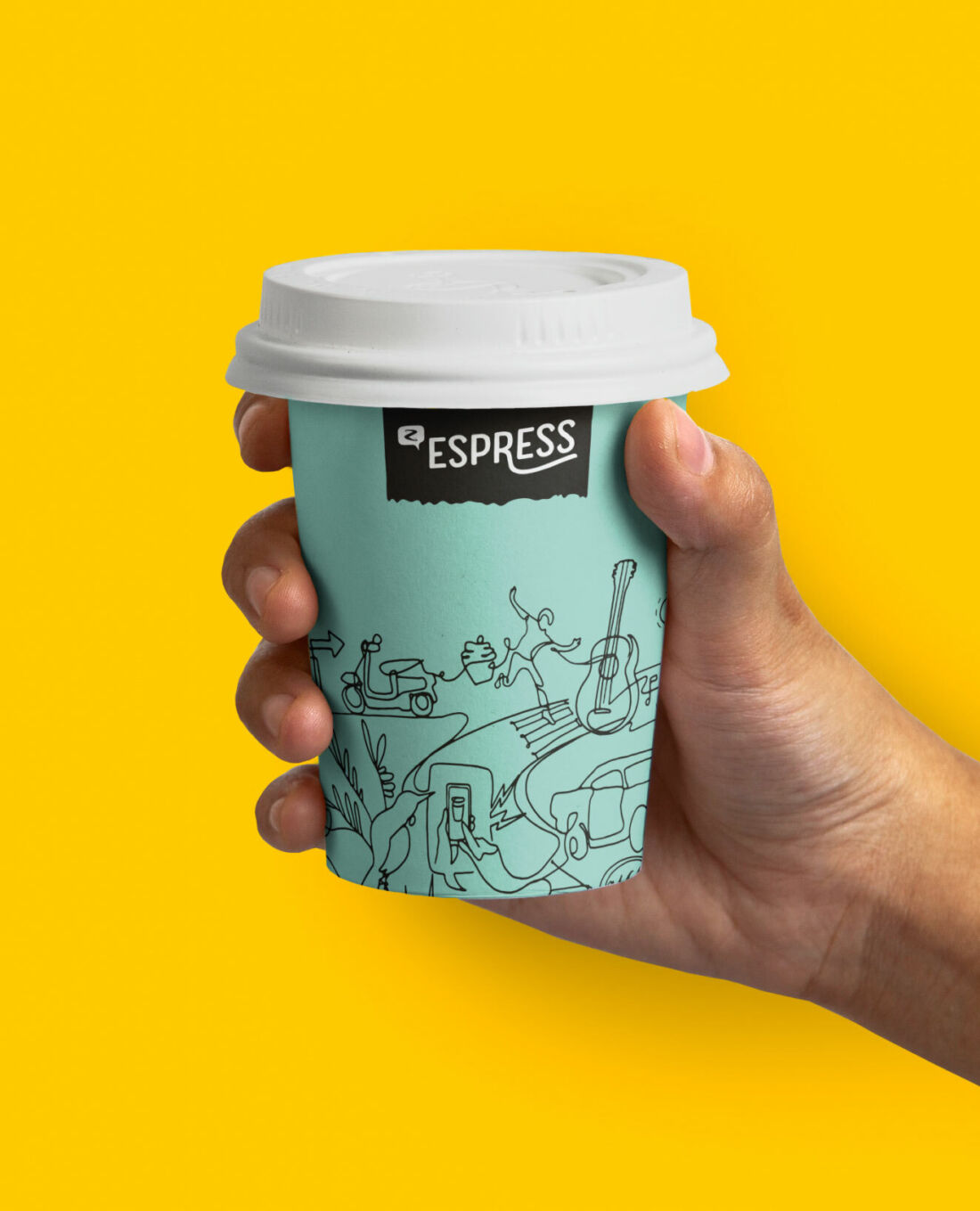
We rebranded Z Espress to help create a clearer distinction between Z’s food and drink offering and their fuel business. Aligning with Z’s playful brand persona, we teamed a down-to-earth personality with a fresh and natural colour palette. The energetic, hand drawn illustrations take inspiration from New Zealand and speak to Kiwis on the go.
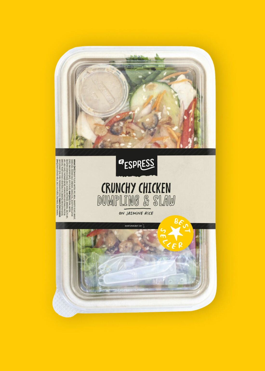
A holistic approach.
Working closely with Z and their producers, we looked at ways to improve the packaging while we were redesigning it. From minimising the amount of air inside FMCGs, to using more sustainable materials. We made sure all their products got a fresh new look. Along with their flagship stores and a nationwide marketing campaign. The fresh and friendly packaging stood out on the shelves and enticed customers to try something new on the go. Most importantly, sales of Z Espress products rose, with coffee orders reaching all time highs.