
Rest
Rest’s rebrand, made real
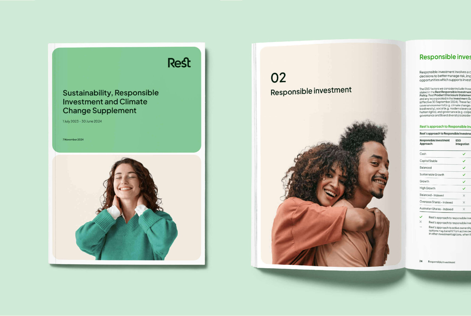
We evolved the design system and scaled it across a huge mix of touchpoints — digital, print, illustration, and motion — taking the brand from guidelines to go-live. We built tools, shaped assets, and worked closely with internal teams to ensure every execution was clear, confident, and cohesive.
With experience and precision, we helped embed the brand in the real world, to resonate across channels while remaining recognisably Rest.
AI illustrations that speak their language
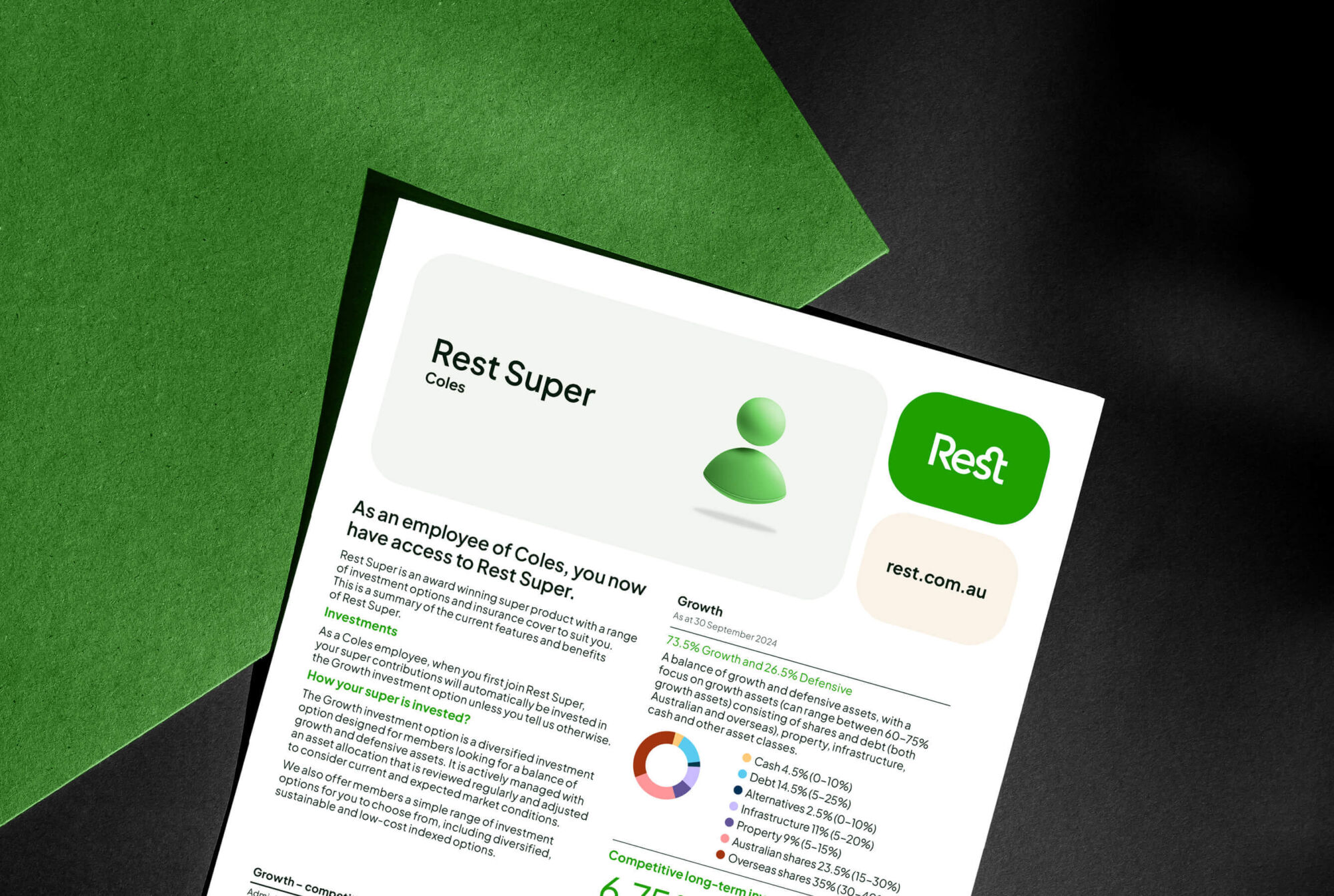
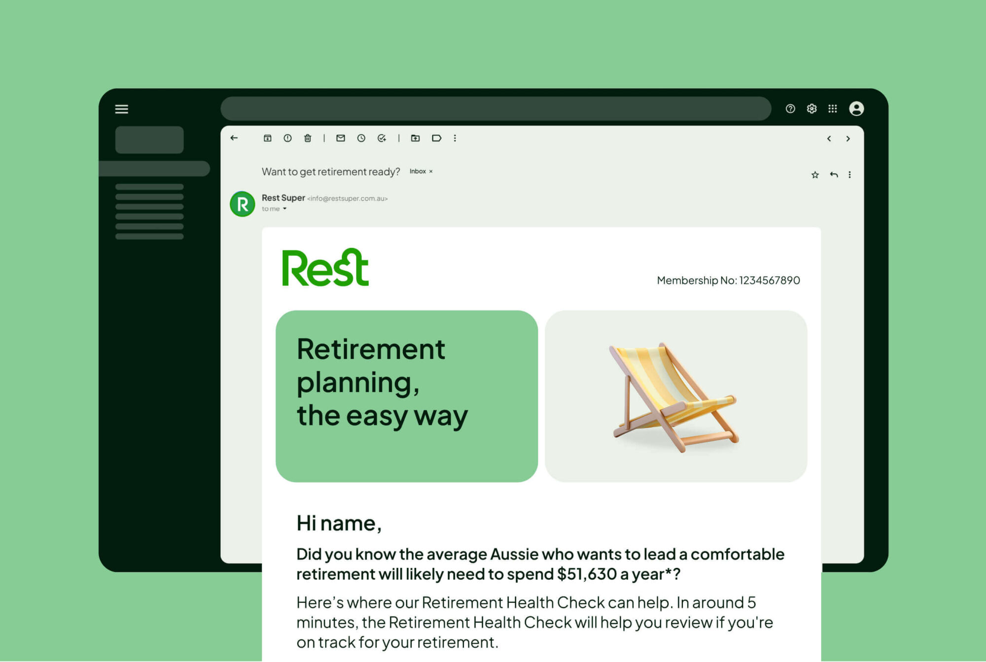
Rest’s members include over 2 million Australians, and more than half are under 30. With this mobile-first and visually driven audience in mind, we leaned into the expressive, emoji-style illustrations as part of the new brand system – designed to connect fast and communicate fluently.
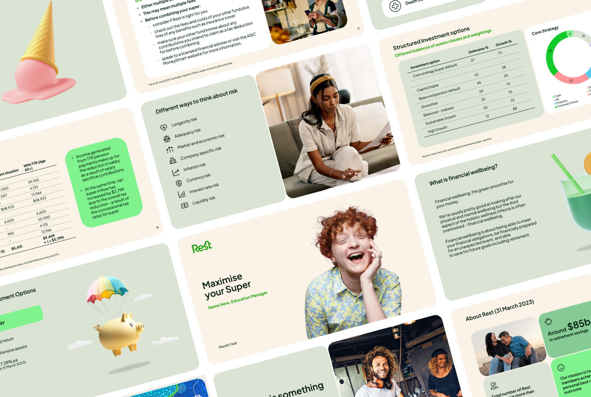
To meet the volume of needs, AI helped generate a high number of distinct, on-brand illustrations. By crafting and refining custom prompts, we kept the style cohesive, the tone just right, and the output unmistakably Rest. This wasn’t off-the-shelf AI, it was carefully steered, iterated, and polished.
Design that moves, literally
When the refreshed brand launched, animation hadn’t yet been explored. So we opened it up to motion with our in-house team — bento boxes that shift and morph to build layouts, smooth transitions, dynamic type, and unexpected moments of delight.
These animations gave the brand an added visual dimension — helping it stand out, guide attention, and create more engaging experiences, especially across digital platforms where impact really counts.