Annual reports: stand-out graphic design where it counts.

In thirty years of designing annual reports for public, private and government organisations, there are a few lessons I’ve learned along the way.
1. A clean, sophisticated layout is crucial
A summary of your company’s highlights and achievements needs to be showcased in the first five to six pages. The organisation’s situation should be presented in ways that are easy to read, accessible and well organised.
2. The big, creative idea behind an annual report drives the look and feel
From a design perspective, a successful annual report looks as if there’s been a minimum of effort put into it, because it’s so easy and inviting to read.
Maximising imagery and pictorial content, and featuring bold graphic and emotive imagery, conveys your story in a dynamic and accessible way. Achieving an appropriate balance of people imagery and narrative complements infographics and copy.
3. Branding needs to be respected and protected
Your brand’s value is important and needs to be treated with great care in your annual reports, particularly in the visual language that’s used to share your story.
Digital annual reports
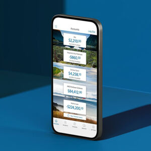
Placing your annual report online gives you the opportunity to make it a more memorable, dynamic and immersive experience for the reader. Online annual reports also let viewers drill down to source further information within the site or via PDF so they’ve got control over reading what interests them.
While we’re no longer using special paper and printing effects to give reports personality and showcase key information, enhancements like video, data visualisation, hover effects and personalised shareholding numbers add a new, richer kind of interactivity. High-end animation techniques now used in the motion picture and gaming industries can also be re-purposed to illustrate complicated financial information and business processes, and will, I’m sure, appear quickly in the annual reporting scene.
Integrated annual reports
Over the past decade, companies have been taking a more holistic overview of their operations in their annual reports, commenting on business aspects that were previously not measured or included. Integrated reporting can build trust and add another valuable level of transparency.
Non-financial resources, now commonly referred to as the six capitals, include financial, manufactured, intellectual, human, social and relationship, and natural. These additional perspectives give your audience a more three-dimensional picture of how your organisation is creating value.
Introducing the six capitals also enhances shareholders’ awareness of strategic priorities. It offers the opportunity to present your company as socially and environmentally responsible, which serves to humanise its operations. Yet despite all this, anecdotal evidence suggests that only 30 percent of New Zealand’s companies produce integrated reports.
Reporting on the six capitals means there’s more information and greater complexity for graphic designers to grapple with. Clever ways of presenting information and stats are required to show connections between various activities and how the six capitals each contribute value in their own unique ways. Expertly designed infographics show how the six capitals have been integrated into your company’s strategic priorities.
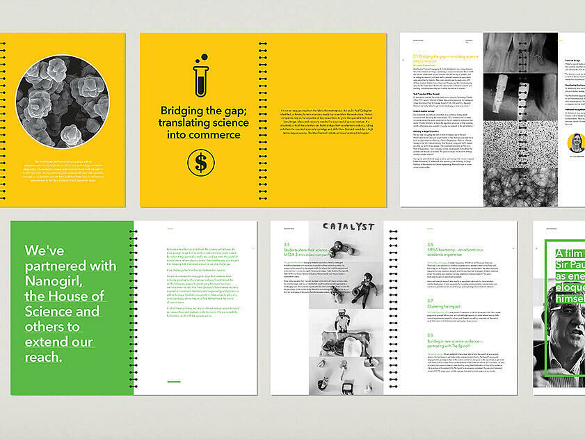
Vibrant colours were used to help readers navigate their way through this MacDiarmind annual report.
The significance of narrative
The way in which your organisation tells its story in an annual report remains a very sensitive issue, as the report is first and foremost a legal document. Directors of listed companies have legal obligations to their shareholders/stakeholders to report accurately on their activities and performances.
Each year the story needs to be told in a fresh, compelling and contemporary way. The narrative needs to resonate with readers at an emotional as well as a pragmatic level. Eye-catching headings and bold typography can punctuate the narrative, creating emphasis where it’s most needed.
A well-told story can humanise an organisation. In addition to capturing a company’s growth over the past year, the stories of its people, their aims, achievements and their other areas of interest can contribute to this humanising process. Achieving the right balance of positive people-focused stories conveys an organisation’s personality and ethos.

A double page spread from the sleek annual report for the Australian Renewable Energy Agency.
How Dave Clark adds value
While you can expect a high level of creativity in our graphic design as a matter of course, the process of producing an annual report also deserves attention. Annual reports need solid project management to ensure maximum accuracy. We’ve got a very experienced team of account managers, project managers, graphic and digital designers, writers and proofreaders who know all the ins and outs of producing an annual report well.
We’ve developed a reputation for working collaboratively with clients, with an emphasis on effective listening skills. We understand that you’re under tremendous pressure to produce your annual report. That’s why we strive to make the process as streamlined and easy as possible.
With our many years of experience and a constant eye on the future, our design and development teams are continually enhancing annual report design and interactivity.
Contact us today to make a time to discuss your next annual report. We’ll show you how to tell your organisation’s story and achievements in a more eye-catching and engaging way.
Annual Report Clients
- ANZ (global integrated report)
- Auckland Transport
- National Arts Council (Singapore)
- Arena (Australia)
- Air New Zealand
- Fonterra Shareholders’ Council
- Foodstuffs
- Mercury Energy
- Vector