The All Blacks silver fern: How to create a legendary brand design.

That silver fern you see on everything from jerseys to teddy bears was designed more than 30 years ago by none other than Dave Clark himself.
Interview with Dave
With Rugby World Cup 2019 just around he corner, let's see what he has to say about how he landed this once-in-a-lifetime brief, his design process, and what it takes to create a logo that stands the test of time.
What was your connection to New Zealand rugby and how did you get involved with creating this logo?
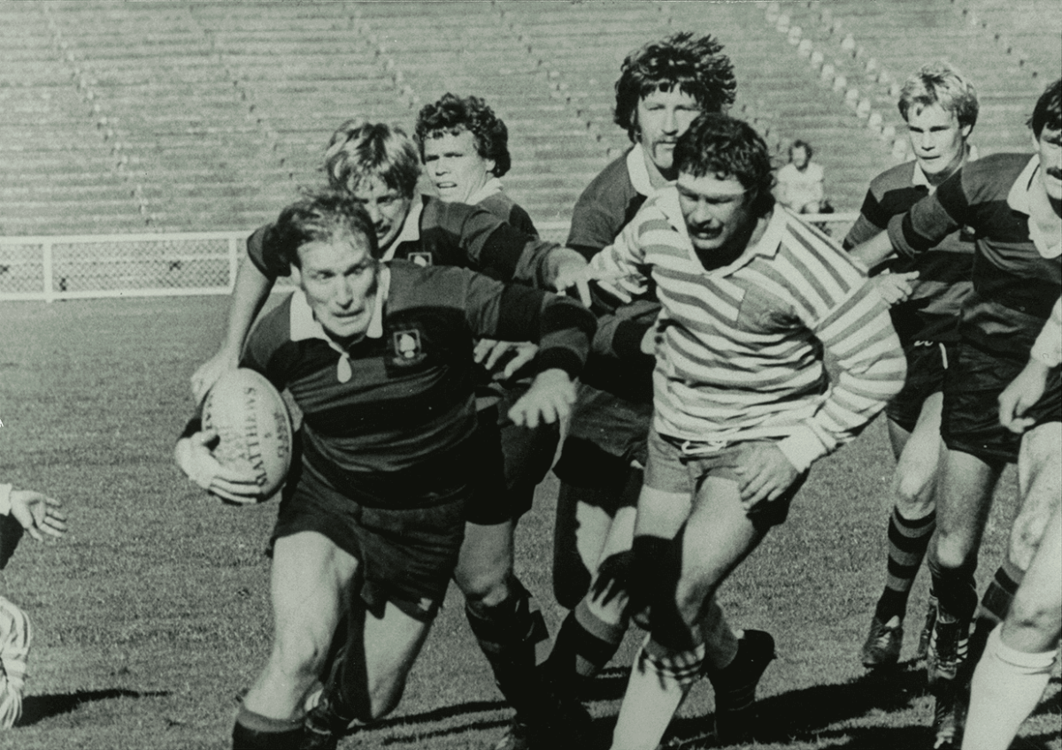
Dave Clark: I’ve always been a keen sportsman and when I moved to New Zealand from England in 1976, I wanted to continue playing rugby at a high level so I joined Ponsonby Rugby Club. At the time, most Auckland-based All Blacks played for Ponsonby so I was on the same team as many rugby greats.
It was a completely different time in the rugby world. You would turn up on Saturday to play and there would be several provincial players and probably two or three current or former All-Blacks in your team, plus the same amount in the opposing team. All these top players were amateurs who also had day jobs. There were lawyers, dentists, labourers, policemen – a real mix. It was a fun time, and how I got to know Andy Haden who played lock while I was a prop in the forwards with him.
When Andy retired from international rugby, he began a talent and management company. At that time I was working as a freelance designer and illustrator and took on graphic design projects for him – brochures, logos and other projects. When the idea of creating a trademark brand design for the All Blacks came up, Andy asked me to do the logo.

Dave Clark playing at the Ponsonby Rugby Club, 1978
Why was Rugby New Zealand, called the New Zealand Rugby Football Union back then, looking for trademark protection?
DC: Andy saw how sports teams in the US were creating extra value by selling branded merchandise, so he suggested that the NZRFU create its own design device and register it along with the All Blacks name. The power of brands just wasn’t that well known in New Zealand in 1986 as it is today.
Can you talk about the silver fern as a graphic device?
DC: The silver fern is a long-standing Kiwi emblem. It first appeared on All Blacks jerseys on their first tour of Great Britain in 1905 and it had been used by the New Zealand Army before that. The Rugby Union used a number of silver fern devices over the years. Some of them had been very large – taking up the whole of the jersey – and some were very small. There was a whole raft of different designs but no consistency or visual links from one to the next when they changed them every few years.
How did you approach turning the silver fern into a trademark-able logo?
DC: I began the graphic design process with a sense of exhilaration and optimism, as I realised it was an important piece of design work which if done properly, could become a national symbol. I went to the Auckland War Memorial Museum and looked at army uniforms, photos of grave markers and photos of rugby uniforms. I also went to Auckland Zoo and got the chief botanist to show me a silver fern plant and talk me through its features. I was very interested in how the plant appears to have a replica of its overall shape duplicated in smaller versions of itself. So what seemed to be quite a simple shape was actually multi-layered and quite complex, which meant it was going to be hard to express visually.
I did get off to a strong start, drawing up what seemed to be hundreds of options. I tried all sorts of leaf edge patterns. Rounded ones, rounded edges, crisscross versions...but I didn’t at any time think that I had hit on the right shape.
Just when I thought I wouldn’t be able to do the job properly and would have to draw one of the less attractive designs up to full scale, I woke up at 3am with a new idea fully formed in my mind. The simplicity was probably why I had missed it in my exploration process. The silver fern leaf is an elongated triangle and my new idea was to make the internal leaves very simple elongated triangles, so that the overall shape echoed the internal small leaves – just like in the real plant. It was all finished in a couple of hours.
I’m a great believer in the power of the unconscious mind to work and solve problems and this is what seemed to happen. When I thought about it later, I realised that the new design drew on research I had done at art school and my unconscious mind pulled all this information together and gave me the answer I was looking for. Once I’d drawn the new fern device, I felt strongly that it would work. Because it was so simple, it also looked elegant. You often find that great design mirrors nature’s simplicity and elegance.
What was the initial reaction when your brand design started appearing in public?
DC: I well remember the launch of the device at NZRFU headquarters in Wellington. I’m not sure how much the rugby folk knew about design but there was a lot of convivial banter about it and they seemed to embrace their world becoming more commercial. At the same time I was working up in the TVNZ newsroom creating news graphics, so I had the unique experience of designing the launch graphics for my own logo.
Believe it or not, as the author of the design and someone who had been living with it for several months, there was a sense of anticlimax when the design was made public. Therefore, I was quite surprised at the uptake because I knew that most people are not that interested in visual design. From early on I started seeing the new silver fern logo and device on all sorts of merchandise and developing quite a bit of momentum.
What do you think makes this logo so enduring?
DC: The reason this graphic design has survived for as long as it has is because it didn’t use any of the design styles that were current at that time. The best logos are always the simplest. So, for instance, while longstanding global brands tweak their livery over the years, their basic design is very strong, and needs very small visual updates to remain current. With the silver fern design, the shapes are so basic and structurally pure, there’s no need to update it. Also, you used to be able to get away with quite complicated images because things were produced at large sizes – the smallest you used to get was putting a logo on a business card. Nowadays, logos need to be reproduced for very small phone screens. So if there is any complexity in an image, it needs to be handled in a very well thought out way. The beauty of the silver fern device, because of its simplicity, is that it can be seen and recognised at any size.

The silver fern - still going strong
What sentiment does it capture and represent today?
DC: It’s always difficult to link emotions and feelings to visual imagery, as they’re quite different, but I do feel that the upward moving leaf design does symbolise forward momentum. And for me at least, captures the essential energy and strength of the New Zealand spirit. It was an optimism I observed when I played rugby with some of the greatest players back then. I still see it because the current All Blacks team trains at the same gym that I do. They have that unique, proud spirit and seek excellence in all they do. It’s what I was using as my inspiration 30 years ago.
Has the process and longevity of this logo affected the way Dave Clark approaches logos and brand design for clients?
DC: Yes it has. As the communication world gets more complex, we as a design agency always try to create imagery and design that will stand the test of time. The longer an image stays in peoples’ minds, the more potent it will become. Thousands of repeated showings of an image will give it remarkable strength and power. You see this with religious symbols, which have a special power all their own. Visual imagery communicates in a way that words cannot, and can lodge very deeply in the mind.
Do you have any advice for companies in regards to rebranding? How to approach it?
DC: When rebranding, try to hang onto visual devices and imagery from the past, and build them into your new platform. In the case of the silver fern, I was building on the long history of the fern device’s application. For that reason, the image was immediately recognisable. It’s the same approach that companies should take if they’re seeking to rebrand themselves and reconnect with their markets in a visual way.

What do you think you need to do to have a legendary brand mark or logo today?
DC: We are living in an increasingly image-driven world, where momentary sightings of logos, photographs and designs are absorbed with amazing speed. Even though everything around us is getting faster, I think the thoughtful, careful approach which I took with the silver fern should be used to design any important symbol or device. You create long-standing logos by absorbing the key elements of a brief, encapsulating these elements in an elegant way, dramatising your key visual features, and making your design instantly recognisable. With methodical research and creative execution, continued use over many years, and thoughtful updates that stay true to the device’s origin, you could create something that becomes legendary.


