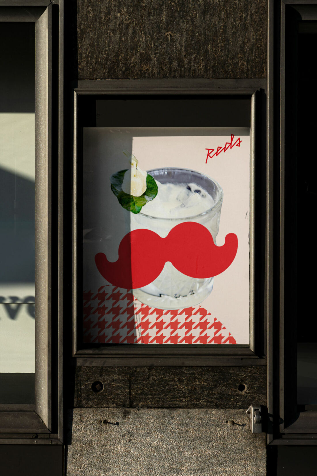
QT Hotels - Reds
Expanding customer bases.
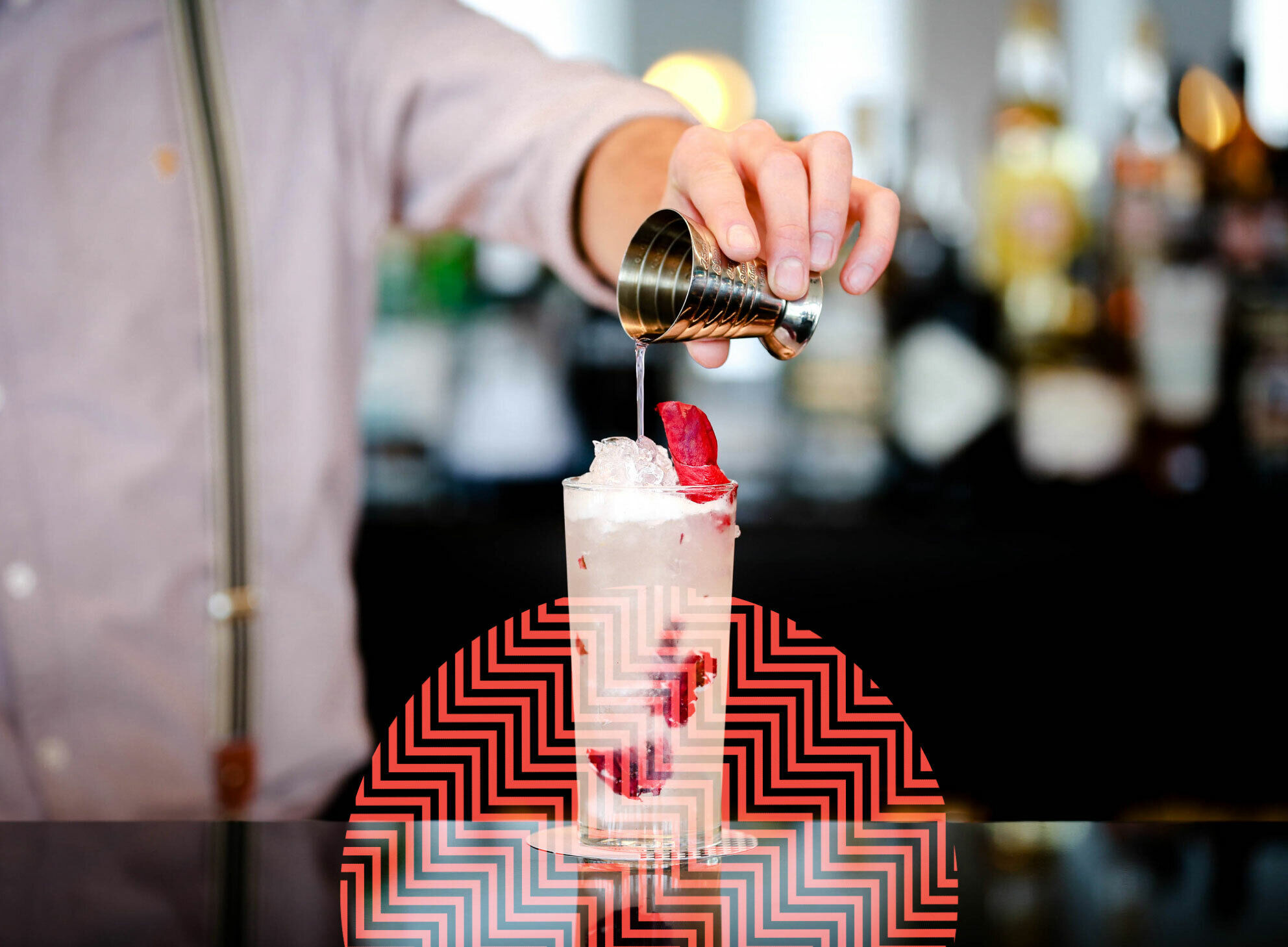
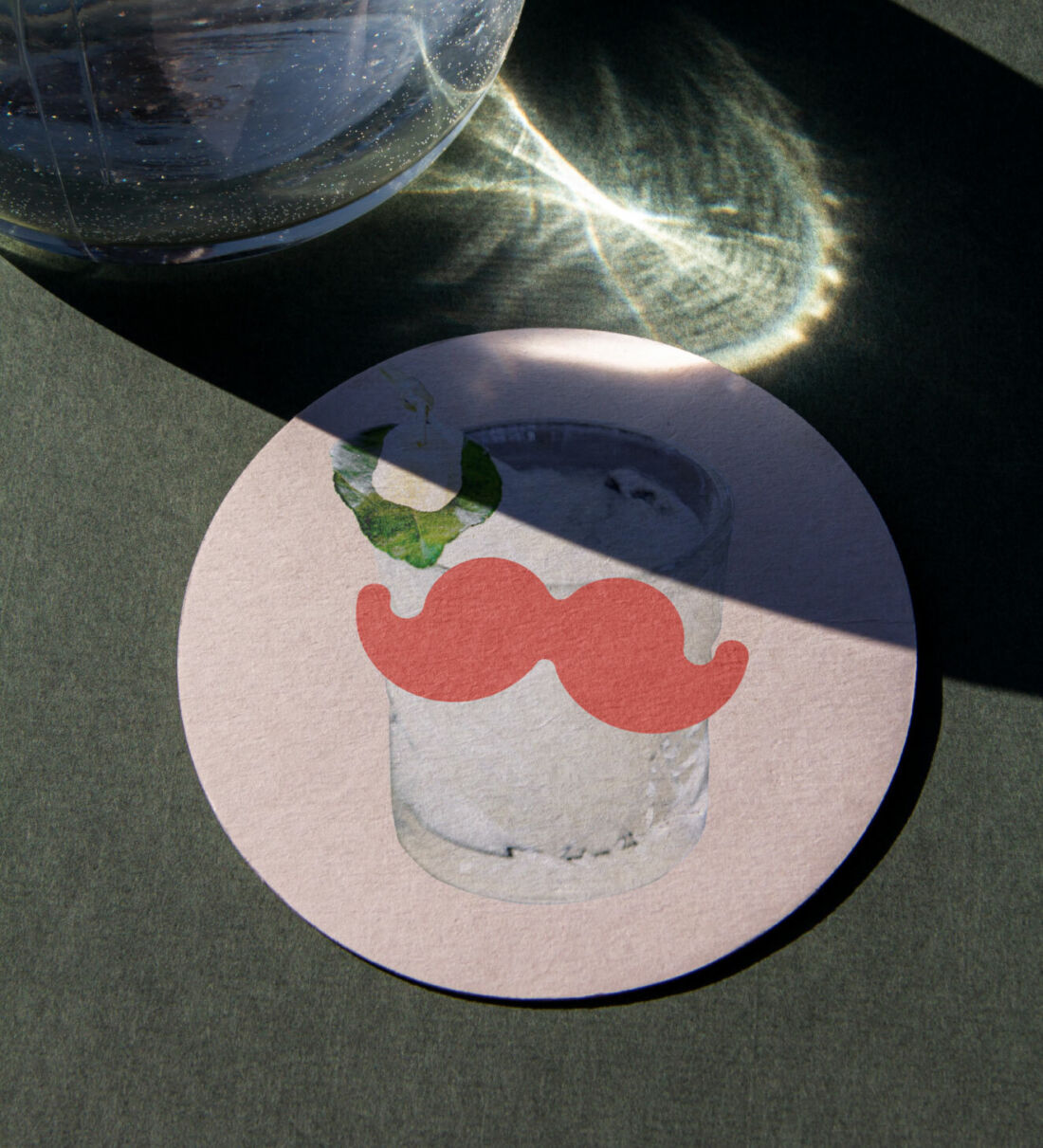
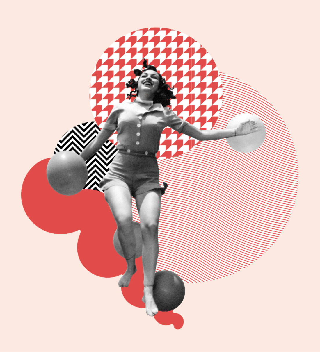
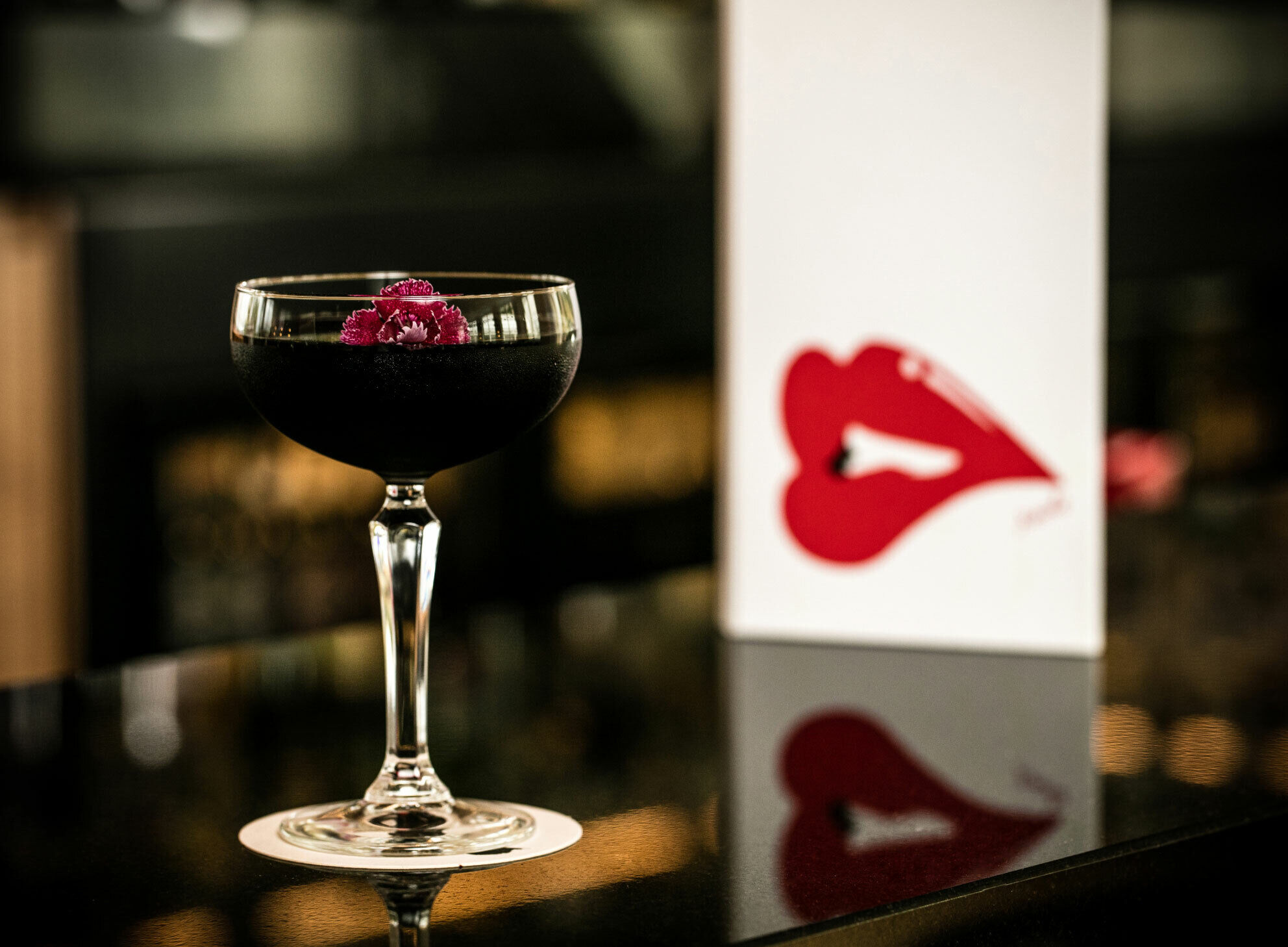
Reds, part of the QT Queenstown hotel, is a bar with views to die for. However, its branding didn’t match the ambience QT wanted to have. To reimagine the atmosphere, they were counting on us to create a more inclusive environment that pulled more tourists, locals and families through the doors. Taking inspiration from vintage skiing catalogues of retro skiers, as well as the pattern swatches of the hotel's furnishings, we introduced a whole lot of red, some fun and just a little bit of sass to the brand.
Cheers to widespread appeal.
Reds now has an identity that gives it a consistent and authentic voice. One that is warm, cheeky and appealing to everyone. The entire design process from workshop to finished art has given the bar a better sense of direction and a robust set of tools and flexible guidelines to follow. Arming the team at Reds with all the tools they need to create ongoing collateral and content.