New Zealand Chamber of Commerce

Two cultures, one voice.
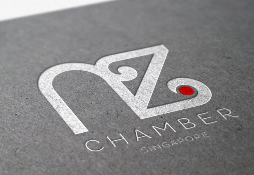
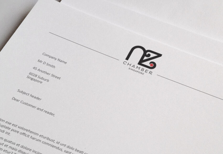
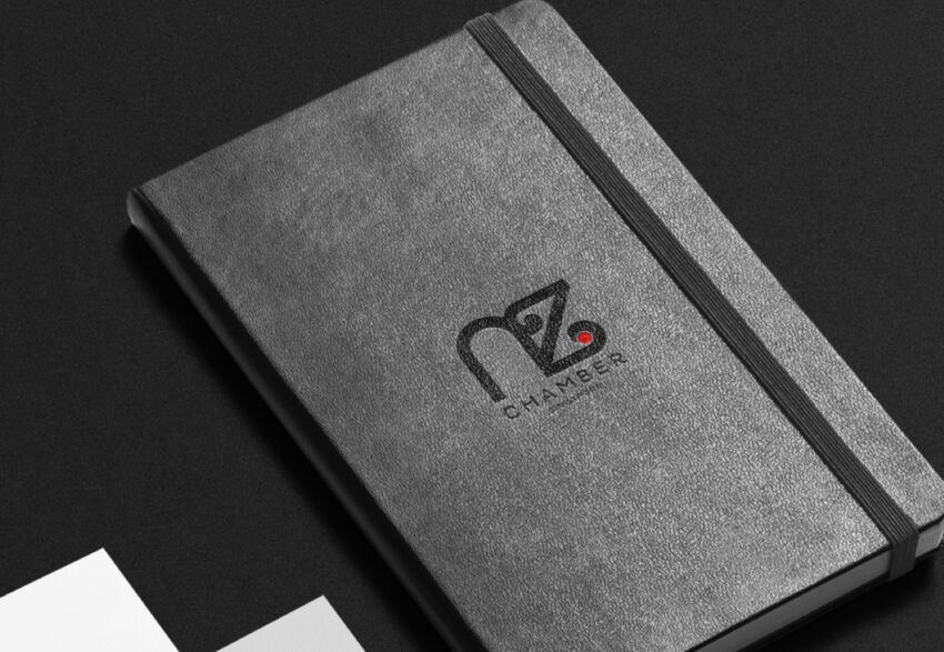
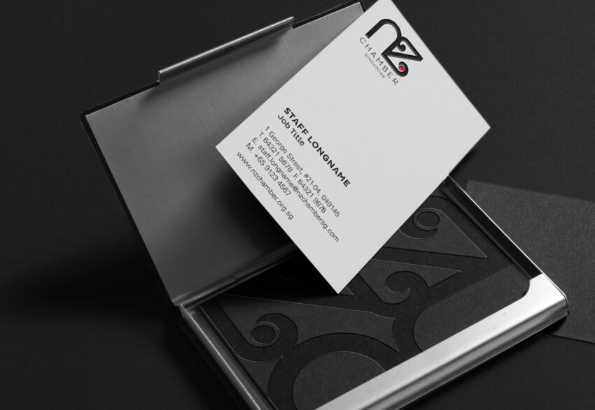
The New Zealand Chamber of Commerce (Singapore) works to connect, promote and grow opportunities for members through networking. They came to us for a new brand identity that conveyed the idea of two cultures working together as one. Uniting elements from both New Zealand (the black koru) and Singapore (the little red dot), we created a contemporary, approachable icon that reflects the shared connection and vision between the two nations. This clean, modern and bold new look, together with the shortened name gives the client a platform to reinforce and sell the New Zealand story.